Most of us wondered or said a long time ago, in our Maths classes: “Why do I have to know about this, I’m never gonna use this in my entire life!”. Well, you were wrong, you will.
In my childhood, I have been sucked into how things work, from a small toy car to a jet engine and SVGs have kept this little bug going for the last few years.
I’ve been fascinated by SVG and what we can do with just a few lines of CSS, and believe me at that time SVG was way far to be simple to interact with; fortunately, it’s very simple today, and with full cross-browser support, if we exclude the supposedly extinct IE.
In this article I will not talk about how to write CSS or best practices to apply it or even the fundamentals of SVG, I will just focus on the “magic” of how to interact with SVG using CSS.
We can find a lot of information over the internet about SVG, so today I will not talk about all SVG’s tags, shapes, animations, properties, attributes, links, interactions, and so on…
Talk about all of this could take at least a week, so let’s focus on essentials today.
I’m going to show you a very simple but very useful use case, that I’m sure most of you at some point needed or will need in your developments. and to do that I will use our own website loading spinning ring through a step-by-step process till we reach the expected result.
So let’s start, since that we need a circular shape, besides of course the SVG tag, let’s start with CIRCLE tag in SVG

We already know that we don’t need any color inside anything, we just need strokes, so we can apply thefill=’none’directly in SVG since that fill default color is black.
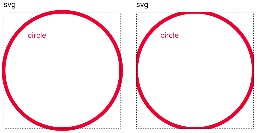
Regarding the circle tag, we have 3 exclusive attributes, cx, cy, and r. The first two attributes (cx and cy) represent the coordinates of the center of our circle, not the top left corner unlike the rect tag (used for squares or rectangles); and finally, r is the radius of our circumference. So in order to position our circle in the middle of SVG we set coordinates as 50%, and then define a value of radius as you like, we use 70 in this case, but we will be able to change it later.
Bare in mind that the SVG tag is like a container that always crops its content, and since that stroke in SVG is divided between inside and outside borders we have to ensure that we have enough space for the entire circle (check the image below). Since the SVG default size is 300×150, we should have enough space to add our spinner, so don’t worry about it.
Now it comes the fun!
Has you know, I hope you still remember it, to calculate the length of a circumference (perimeter), we have the mathematical formula 2πR, in SVG we use this to set the length of the stroke around circles as well.
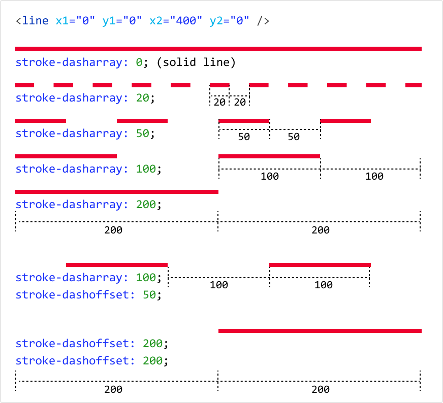
SVG shapes have 2 properties to set dynamic dashed strokes, stroke-dasharray (define the length of the line and spaces in our stroke) and stroke-dashoffset (define the initial position of the first element of our stroke). For better understanding, let’s check a simple SVG line with 400px and the respective dashed stroke in the examples below.
Having this we now have conditions to animate our stroke in order to fill and empty the spinner.
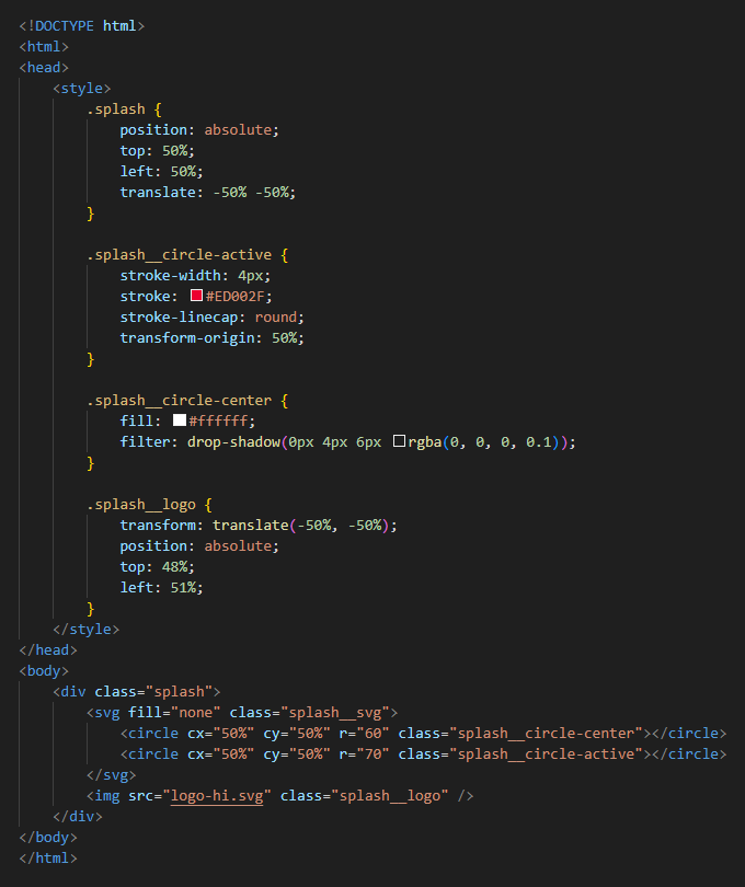
To focus just on our animation we create a few elements, an absolutely positioned div in the middle of the screen, and add the SVG inside of it, with of course some CSS to give some thickness and color to our stroke. We also added another circle tag to create the container of our logo. Now we should have something like this:
Now it’s time for calculation, so in order to have a full turn around the clock we need stroke-dasharray to be a perimeter of the circle, so, considering thatπ ≈ 3,14 we can calculate it like this:
2 x π x R (radius) = 2 x π x 70 ≈ 439.8
Now we can set the stroke-dasharray as 439.8. By default this is px units number, so you can add it or not.
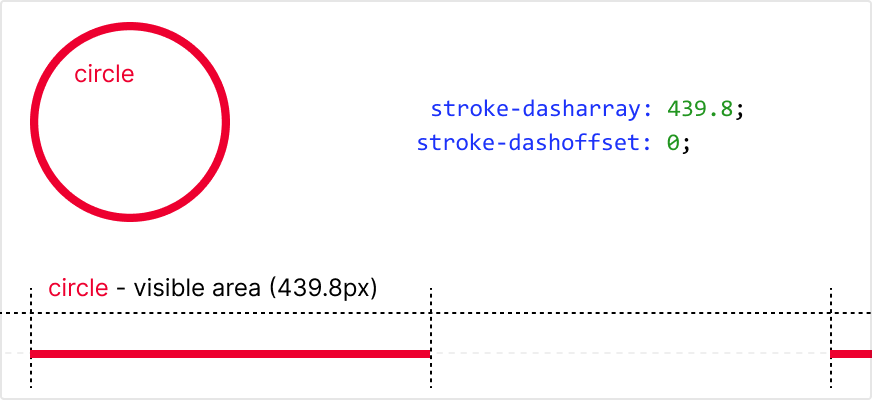
To resume, setting a value on stroke-dasharray property we are always setting 2 values, the line and the space sizes of the dashed line design. With the last calculation, we measure a full turn of our circumference, so by setting stroke-dasharray with the precalculated value we are setting not only the length of the line part of our dashed line (stroke) but also, the space part of it.
For better understanding what we are doing here, I squished the circumference into a straight line
Now we are able to animate our line. We already set the length of the stroke, now in order to animate the line, we use stroke-dashoffset. What this property does is set the starting position of the stroke. Check what is happening in the animation below.

However, if we loop this stroke-dashoffset it will be awkward, as you can see in the animation above, after filling the stroke immediately runs out, and we don’t want that, we need the animation to keep running, filling and emptying as we could see in the first animation.
For me it’s cleaner if we start our spinner empty and only then animate filling it, and an easy way to do this is starting with negative offset, setting the start value animation on -439.8 and the final keyframe at 439.8, but I discourage you to do that, as some browsers don’t have full support on negative numbers. So for full browser support keep stroke-dashoffset always positive.
For this demonstration, let’s keep it as simple as possible, and let’s start the animation on 0 (zero).
Considering that for each 439.8 unit, we have respectively a stroke full fill or a stroke empty (recall that 439.8 sets both sizes line and space part), so setting stroke-dashoffset to 2 x 439.8 will be exactly the same as0 (zero). Having this, to make a full turn with fluid animation we need to end exactly where we start, setting the end keyframe as 879.6(2 x 439.8 will create a full circle – 1 unit with line and 1 unit with space).
I’m sorry about the testament . Lets check the animation below for better understanding.

Now we just need to add CSS keyframe animation, and we have our spinner… or not . I love animation and this one is too simple, so at least we need to make it also rotate, and since that we already have to add keyframes it’s easy.
Just one more thing, following the steps we get backward animation, different from the original; if you prefer, as I do, that the spinner runs on clockwise you just have to switch the values of start and end stroke-dashoffset
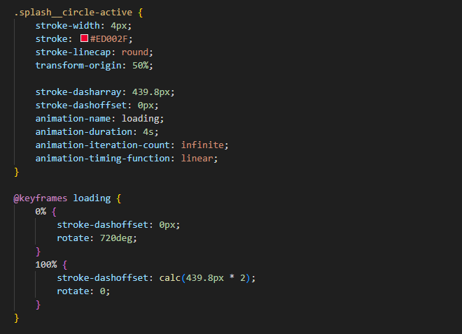
Ready to spin? Apply this kind of animation in your projects even if it is just a loading for an image or a full page load, it will give feedback to the users and maybe they will wait a lit bit long for data to come.
Extra step
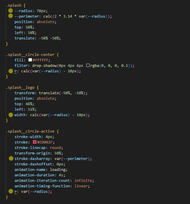
We are using CSS, so why not add some dynamic variables to our CSS in order to have stroke-dasharray and stroke-offset calculated with the radius of the circumference, with this we no longer need to calculate this again. We can use the r (radius)and set a few properties according to the CSS variable–radius, and with this, we only need to change it to increase or decrease our spinner.
To better understand it check the image below where changed properties have a yellow ball on the side.
Conclusion
In conclusion, SVGs have evolved to become more accessible and widely supported, allowing seamless interaction with CSS. Although there is a vast range of SVG elements and properties to explore, we focused on the captivating magic of CSS-SVG interaction in this article.
By harnessing CSS properties like stroke-dasharray and stroke-dashoffset, we unlocked the ability to create fluid animations that fill and empty spinners. Incorporating keyframe animations and rotation further enhanced the visual appeal. Implementing these techniques in projects, whether for image loading or page transitions, can provide valuable user feedback and improve overall user experience. Embrace the art of SVG-CSS interaction to elevate your designs with engaging animations and user-friendly interactions.


