Modern operational systems generate large amounts of time-based data — schedules, movements, routes, and events that unfold across ordered locations. Making sense of this data requires more than tables and spreadsheets. It requires visualization.
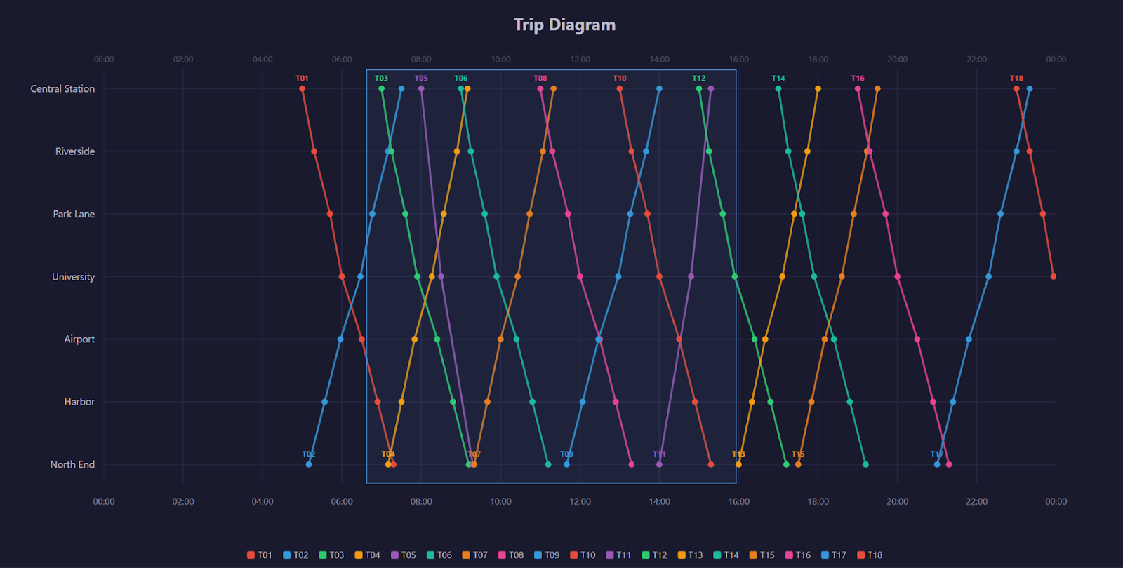
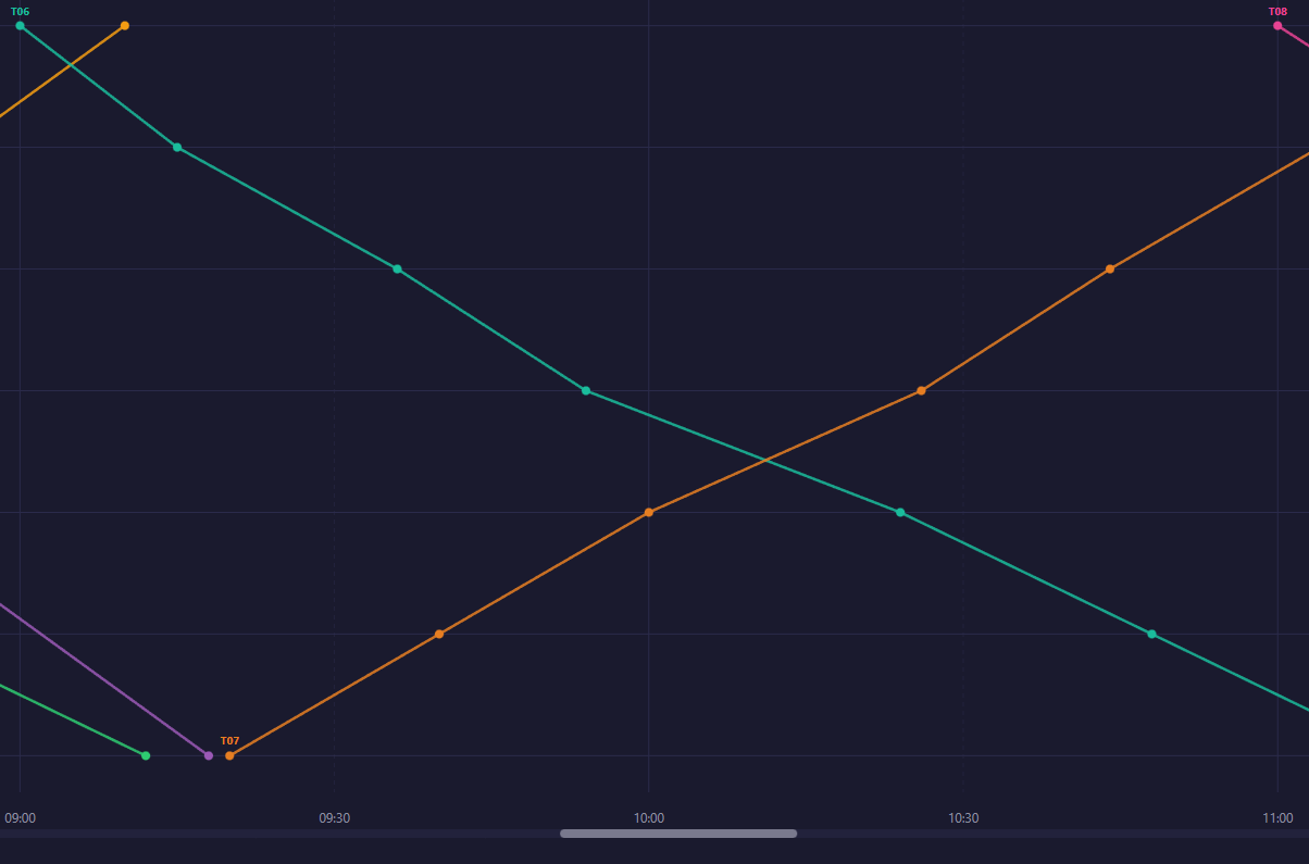
One of the most effective ways to represent movement over time is the trip diagram, also known as a Marey chart. Originally developed in the 19th century to analyze railway schedules, this model maps time on the horizontal axis and locations on the vertical axis, drawing each journey as a continuous line.
Despite its historical origins, the underlying idea remains highly relevant. The structure, entities moving through ordered stages over time, appears in transportation systems, logistics platforms, project scheduling tools, and many other domains.
In this article, we explore how to engineer an interactive trip diagram using React and D3.js. Rather than focusing only on drawing lines, we examine:
- Data modeling decisions
- Rendering strategy
- Interaction engineering
- Performance and scaling considerations
The goal is not just to recreate a classic visualization, but to demonstrate how to build a scalable, maintainable interaction system for time-based data.
1. What Is a Trip Diagram?
This type of chart was popularized by E.J. Marey in the 1880s to visualize the Paris-Lyon train schedule. The core idea is simple:
- X axis = time of day
- Y axis = stations along the route (ordered by physical distance)
- Each line = one train journey
The slope of each line tells you the train’s speed: a steeper line means a faster train. Where two lines cross, two trains pass each other.
2. React + D3 Integration Strategy
We use React to own the container lifecycle (mounting, unmounting, sizing) and D3 to own the SVG content (drawing, interaction, transitions). The bridge is a useRef + useEffect:
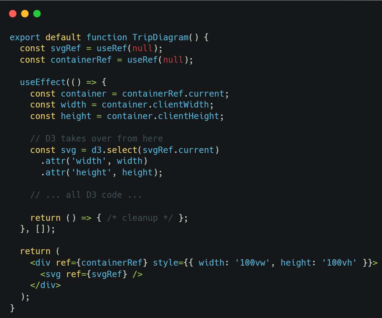
Key technical points:
- containerRef measures the available space
- svgRef gives D3 a DOM node to work with
- The empty [] dependency array means this runs once on mount
- The return function cleans up any DOM elements D3 created outside the SVG (like the tooltip div)
3. Data Modeling
A clear data model is the foundation of any meaningful visualization. Before drawing a single line, we define how stations and trains are structured so that the diagram can be generated directly from the data.
The goal is simple: let the structure of the data drive the structure of the visualization.
Stations Structure
Stations are represented as a flat, ordered list.
Each station appears once, and the order reflects its physical position along the route.
This order is essential because it determines how stations are positioned vertically in the diagram. The visualization does not “guess” their placement — it simply maps each station to a consistent position based on its sequence.
By keeping this structure simple and explicit, the layout remains predictable and easy to maintain.
Trains Structure
Each train is modeled as:
- A unique identifier
- A visual color
- An ordered list of stops
Each stop contains:
- The station name
- The time of arrival or departure
This structure mirrors how a journey actually unfolds — as a sequence of stops over time.
Because the stops are ordered, the diagram can connect them directly, creating the familiar diagonal lines that represent movement.
The Minutes-from-Midnight Approach
Instead of storing time as formatted strings (e.g., “08:30”), we convert all times into minutes from midnight.
For example:
- 08:00 → 480
- 12:30 → 750
This simplifies calculations and makes the time axis easier to manage. Zooming, panning and filtering become straightforward numeric operations rather than complex date manipulations.
Internally, the system works with numbers for efficiency, while formatted time labels are generated only for display.
Why the Order of Stops Matters
The order of stops is what defines direction and movement in the diagram.
The visualization connects stops in the sequence they are provided. This means:
- Outbound trains list stations from start to end
- Inbound trains list stations in reverse order
No additional “direction” flag is required. The geometry of the line naturally reflects the journey’s direction based solely on the order of stops.
This keeps the rendering logic simple and data-driven. Instead of adding special rules for direction, we let the structure of the data define the behavior of the visualization.
By modeling stations and trains clearly and intentionally, the visualization becomes a direct expression of the underlying data.
When the data is well structured, the rendering logic stays clean — and the system remains easy to extend, scale, and maintain.
4. Setting Up Scales and Layout
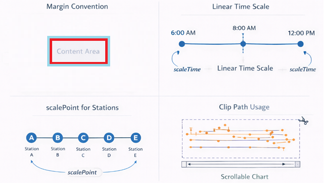
Margins
To keep the visualization clean and readable, we reserve space around the edges for axis labels and contextual information. This ensures that the data itself has a clear, dedicated drawing area, while labels and grid references remain visible and uncluttered.
In practice, this creates a structured layout where everything has a defined place — improving both clarity and maintainability.
Linear time scale
Time is represented as a continuous horizontal axis, spanning the full 24 hours of the day. We use a simple linear mapping between time and screen space. This ensures that:
- Proportions are accurate
- Speed differences are visually meaningful
- Zooming and panning feel natural
Because time progresses continuously, a linear scale keeps the visualization intuitive and precise.
scalePoint for stations
Stations are discrete stops along a route, so they are positioned evenly along the vertical axis. Each station receives a clear and consistent position, preserving the physical order of the route.
This makes the diagram easy to read and ensures that movement between stations appears structured and predictable.
Clip Path
To keep the visualization clean during zooming and panning, we restrict drawing to the visible chart area. Anything that falls outside that region is automatically hidden.
This prevents visual elements from overlapping labels or spilling into margins, maintaining a polished and controlled presentation at all times.
5. Rendering Strategy
Designing an interactive visualization is not only about drawing shapes — it’s about deciding how the system updates itself when users interact with it.
In this project, we deliberately chose a clear and predictable rendering strategy.
Deterministic Redraw
Every time the user zooms, pans, or resets the view, the chart is fully redrawn based on the current data and visible time range.
Instead of modifying individual elements, we rebuild the visual state from scratch.
This makes rendering behave like a pure function:
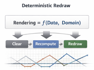
The result is a system that is easy to reason about, easy to debug, and resistant to subtle state inconsistencies.
Why Not Transitions?
D3 offers powerful transition capabilities. However, animated scale transitions would require updating multiple elements individually and synchronizing their behavior.
For this type of operational visualization, clarity and predictability are more important than animation effects.
By avoiding transitions, we ensure:
- Immediate feedback
- Simpler update logic
- Fewer edge cases
The interaction remains responsive and straightforward.
Why Not Incremental Mutation?
Another common approach is to update only the elements that change — modifying attributes instead of rebuilding the chart.
While this can be efficient at a large scale, it introduces additional complexity. The system must carefully track which elements exist, which need updating, and which must be removed.
For moderate-sized datasets, this added complexity provides little benefit. A full redraw keeps the logic clean and eliminates hidden state drift.
Simplicity, in this case, improves reliability.
Performance Reasoning
At the scale of this visualization (roughly 100–200 SVG elements), a full redraw is effectively instantaneous.
Modern browsers handle this level of DOM manipulation without noticeable performance impact. The difference between full reconstruction and partial updates is negligible — but the difference in code clarity is significant.
In other words, we optimize for maintainability first, because performance is already well within acceptable bounds.
When We Would Change Strategy
If the dataset grew substantially — for example, thousands of simultaneous trips — we would reconsider this approach.
Possible adaptations would include:
- Switching from SVG to Canvas for higher rendering throughput
- Rendering only the visible time range (virtualization)
- Using incremental updates instead of full redraw
- Offloading heavy computations to a Web Worker
The chosen strategy reflects the current scale and requirements of the system. As those requirements evolve, the architecture can evolve with them.
Rendering is not just a technical detail — it is an architectural decision.
By prioritizing deterministic behavior and clarity at this scale, we ensure the visualization remains robust, predictable, and easy to extend.
6. Interaction Engineering
Building an interactive visualization is not just about rendering data — it’s about designing how users explore and interact with it.
In this diagram, interaction is treated as a deliberate layer of the system, not an afterthought.
Layering as an Event System
In SVG, visual stacking order also determines how interactions behave.
Elements rendered later appear on top — and they are the first to receive mouse events. This means that the structure of the SVG directly controls how hover, drag, and zoom interactions are prioritized.
We use this to our advantage:
- The brush layer captures drag gestures for zooming.
- The interaction layer sits above it to capture hover events for individual trains and stops.
If the cursor is over a station dot, it receives the event. If it’s over empty space, the zoom interaction takes over.
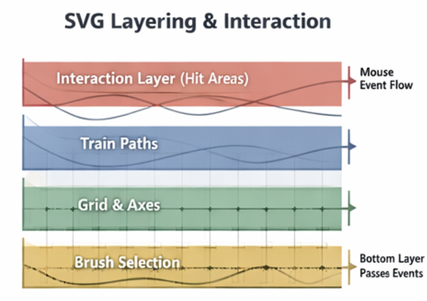
By intentionally structuring the layers, we create a predictable and intuitive interaction hierarchy.
Invisible Hit Areas
Thin lines are visually clean — but difficult to hover precisely.
To improve usability, we add invisible interaction layers on top of the visible paths. These wider, transparent elements capture pointer events without changing the appearance of the chart.
This approach:
- Makes hovering easier and more comfortable
- Preserves visual clarity
- Improves accessibility and user experience
It separates visual design from interaction design — allowing each to be optimized independently.
Tooltips
Tooltips provide contextual information without cluttering the visualization.
Instead of embedding text directly inside the SVG, we use a lightweight HTML element positioned above the chart. This allows:
- Rich formatting
- Flexible styling
- Clean positioning relative to the cursor
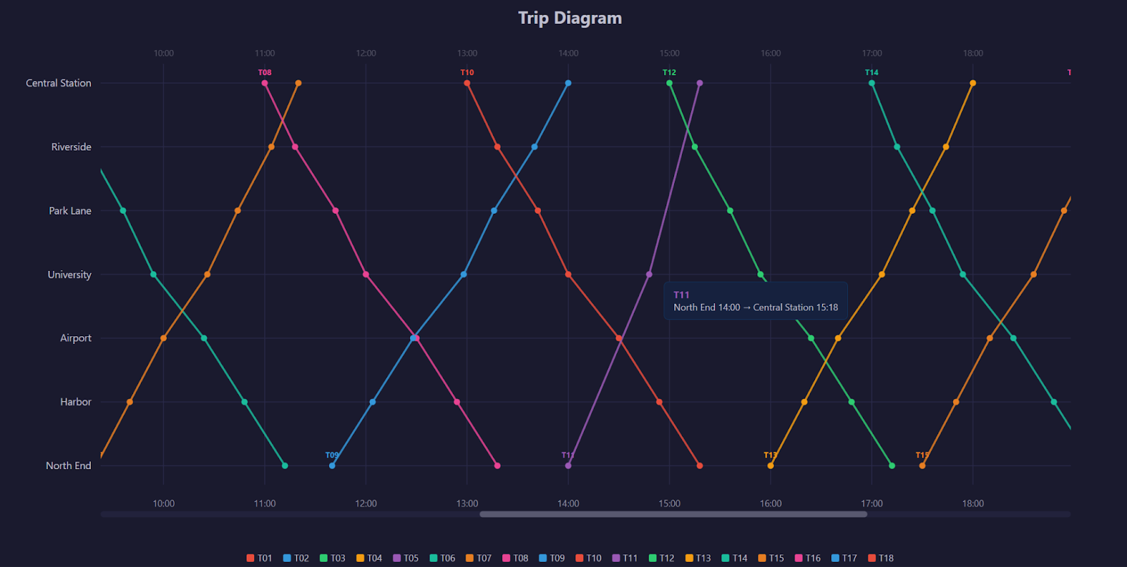
Tooltips appear only when needed and disappear instantly when the cursor leaves the element, keeping the interface focused and uncluttered.
7. Zooming and Panning
To make the diagram truly useful, users need to explore specific time ranges without losing context.
Instead of treating zoom and pan as isolated features, we built them around a single principle:
The visible time range is the source of truth.
All interactions update that range — and the visualization redraws accordingly.
brushX mechanics
Zooming is implemented using a horizontal brush interaction.
Users can click and drag across the chart to select a specific time window. This gesture defines a new visible range along the horizontal axis.
The brush provides a natural, intuitive way to zoom:
- Drag to select
- Release to zoom
- Double-click to reset
It feels direct because the user is interacting with time itself.
Domain Recalculation
When a selection is made, we convert the selected pixel range back into time values.
In other words:
- The user selects an area on the screen
- We translate that selection into a new time domain
- The chart redraws using that updated domain
This keeps the system simple and consistent: zooming is just changing the visible time range.
All other elements — grid lines, train paths, labels — automatically adapt.
Wheel Panning Logic
Once zoomed in, users can move through the day using the mouse wheel. Rather than scrolling the page, the wheel shifts the visible time window left or right.
The movement speed is proportional to the current zoom level. A narrow window moves in smaller increments, while a wider window moves more quickly.
This creates a smooth and controlled navigation experience that feels natural at any zoom level.
Custom Scrollbar
When zoomed in, a visual scrollbar appears beneath the chart.
The scrollbar serves two purposes:
- It shows the current visible portion of the full 24-hour range
- It allows users to drag the window left or right
The width of the scrollbar thumb represents how much of the day is visible. Its position reflects where that window sits within the full timeline.
This provides spatial context and reinforces the idea that the chart represents a larger system.
State Synchronization
All interaction methods — brushing, wheel panning, and scrollbar dragging — update the same internal time range.
Because they share a single source of truth, the system remains synchronized:
- Zooming updates the scrollbar
- Dragging the scrollbar updates the chart
- Wheel panning adjusts both
This unified state model ensures consistent behavior and avoids conflicting interactions.
Zooming and panning are not separate features — they are different ways of manipulating the same time domain. By centralizing state and letting the visualization respond deterministically, we create a fluid and predictable exploration experience.
8. Performance and Scaling Considerations
This visualization is designed to perform smoothly at its current scale. However, when building interactive systems, it’s important to consider how the architecture would adapt as data volume grows.
Performance is not just about speed — it’s about choosing the right strategy for the right scale.
SVG vs Canvas Tradeoffs
This implementation uses SVG, which provides:
- Clear structure and inspectable elements
- Built-in support for hover interactions
- Fine-grained control over individual elements
SVG works exceptionally well when the number of visual elements is moderate.
However, as datasets grow into thousands or tens of thousands of elements, SVG’s DOM-based model can become a bottleneck.
In those cases, Canvas may be a better choice. Canvas renders directly to pixels rather than creating individual DOM nodes, which significantly improves rendering performance at large scale — though at the cost of more manual interaction handling.
The choice depends on dataset size and interaction requirements.
Virtualization Strategy
At larger scales, rendering every element at all times becomes unnecessary.
A virtualization strategy focuses only on what is currently visible. For example, when zoomed into a narrow time window, the system can render only the trains that intersect that range.
This ensures performance scales with what the user sees — not with the total size of the dataset.
By reducing unnecessary work, the interface remains responsive even as data grows.
Web Worker Use Cases
As datasets expand, data processing can become computationally intensive.
Heavy tasks such as:
- Preprocessing large schedules
- Filtering complex datasets
- Detecting conflicts or overlaps
Can be moved to a Web Worker — a background thread that runs separately from the main user interface.
This prevents the interface from freezing and ensures smooth interaction, even during intensive calculations.
Incremental Updates vs Full Redraw
In this implementation, the chart is fully redrawn on every interaction. At the current scale, this is simple, reliable, and effectively instantaneous.
At larger scales, incremental updates may be preferable. Instead of rebuilding everything, the system would update only the elements that changed.
This reduces DOM operations and improves efficiency, though it increases implementation complexity.
The choice between full redraw and incremental updates depends on dataset size and performance requirements.
Performance strategy is always contextual.
The current approach prioritizes clarity, maintainability, and responsiveness at moderate scale. As requirements evolve, the architecture can evolve with them — switching rendering techniques, optimizing updates, or offloading computation when necessary.
Scalable systems are not defined by premature optimization, but by the ability to adapt when scale demands it.
9. Conclusion
Building an interactive trip diagram is not just an exercise in drawing paths — it is an exercise in system design.
Throughout this implementation, we focused on more than visual output. We defined a clear data model, established a predictable rendering strategy, and engineered interaction as a structured layer of the system. Zooming, panning, and hovering are not isolated features — they are coordinated behaviors built around a single, consistent time domain.
By favoring deterministic redraws, clear state ownership, and intentional layering, the visualization remains easy to reason about and extend. At its current scale, this approach prioritizes clarity and maintainability without compromising performance. If requirements evolve, the architecture can evolve with them — adapting rendering strategies or scaling techniques as needed.
More importantly, the pattern behind this solution is reusable. Any system that models entities progressing through ordered stages over time — from transportation and logistics to scheduling and operational monitoring — can benefit from the same architectural principles.
The key takeaway is simple:
Effective data visualization is not just about rendering shapes.
It is about designing state, interaction, and structure in a way that remains robust as complexity grows.
By treating interactive visualizations as engineered systems rather than isolated components, we build solutions that are not only visually compelling but scalable, maintainable, and adaptable.