
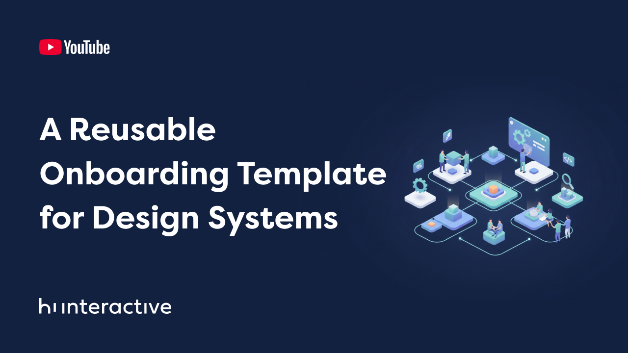
What is a component?
Components are reusable, independent blocks that allow you to split your User Interface into several pieces. This provides you several advantages such as:
- Your UI will be consistent;
- Your UI will be easier to maintain and update, meaning that you won’t need to rewrite your code again and again;
- Your UI will be user-friendly, so the person who is accessing your application will get used to it easily. This means your UI is less prone to user error.
A component can be basically anything and in terms of the Outsystems Platform a component is “no more” than a block. They can be as simple as a single HTML element or as complex as a combination of several elements. We previously discussed creating a UI component in the Masterclass ‘How to Create a UI Component,’ where we demonstrated how to create a Card component. Now let’s try to create a more complex one.
What composes a component
A component can accept Input Parameters which are used to provide data to the component by associating the parameter value to the scope of the component. A component can also have client actions to run some logic on the client side and those actions can be triggered by a click on some element or for example be triggered by Javascript. Then we also have events. A component can have one or more events that allow data to be passed from the block to its parent (another block or a screen).
When discussing actions and events, it’s important to consider the events that make up the lifecycle of a block. Let’s talk a little bit about each of those events.

On Initialize
You can use it to initialize the Block by setting its default data.Use cases:
- Assign a variable based on inputs or in some computation in JavaScript;
- Access variables of the JavaScript window object.
On Ready
Occurs after the Block DOM is ready.Use cases:
- Add listeners to a DOM element;
- Set focus on an input widget.
On Render
Occurs right after the Block On Ready event handler and every time the data of a Block changes.Use cases:
- Act upon a change in the data of the Block to update another component.
On Parameters Changed
Occurs anytime the parent Screen or Block changes one of its input parameters. Changes to the input value inside the block do not trigger this event handler. You can use it to react to changes in the Block parameters, such as to update variables.Use cases:
- Refresh an Aggregate or Data Action that depends on that input parameter;
- Recalculate a variable that depends on the input parameter.
On Destroy
Occurs before destroying a Block and removing it from the DOM. You can use it to implement logic when the component is disposed of, such as to remove event listeners.Use cases:
- Call the destroy action of another components;
- Remove JavaScript listeners.
Let’s build a component use case
For our demo let’s consider the following use case:
We need a component to help us build a product list page that will allow the users to search for whatever item they want on an online store.

With the inputted value by the user we search on a REST API for a product that can then be added to a shopping cart. We fetched the data by doing a HTTP GET request on https://dummyjson.com/products/search?q={product} where the product parameter is the inputted value. The server will return us a response in the JSON format. A JSON (JavaScript Object Notation) is a lightweight data-interchange format widely used that became the universal standard of data exchange.
The JSON response provided if we search by an iphone will be something like:

As you can see this returns, apart from a few other properties, an array of products containing several attributes for each item. For our scenario, we only need to display a subset of the product information returned by the API.
Our component will allow us to display the list received by input parameter on the interface and to alert the component’s parent (another block or a screen) that the user has finished typing on the input. Once the parent component is alerted, the developer could choose to search the API for products based on the user input or update the UI with relevant product information.
The component: SearchableList
The component that we built is called SearchableList and is composed of the following parameters, actions, events and placeholders:

Let’s explain each parameter, action, event and placeholder that the component has. In terms of input parameters we have:
Parameters
- AddItemText: A text input parameter to allow you to choose the text on the button that is displayed for each element of the list;
- List: A SearchableListStructure List that contains two attributes, Id and Text, meaning that each element on that list has just two elements but they can be whatever you want. In the demo we will provide you will see that a list of products coming from an API will be mapped into this list;
- ExtendedClass: A text parameter that will allow you to add one or multiple css classes such as margins, paddings, etc.
Actions
- OnParametersChanged: We are going to use this action to stop the loading animation;
- OnReady: Action triggered after the component DOM is ready. Remember what we talked about the OnReady action? Guess what, now we are adding an event listener, in this case, an input one, to the input that may or may not be provided on the Input placeholder. We check if the input exists and then on the event listener we use a function debounce to only request after the user stops typing for half a second as we don’t want a request for each inputted character. To the debounce function we pass an arrow function that calls the TypingFinished client action of the component:

- TypingFinished: A client action that displays a loading animation and triggers the TypingFinishedEvent to then be captured by the block’s parent element (another block or a screen).
Events
- SelectedItemEvent: An event triggered on click of the button that is displayed for each element of the list and that receives the Id of the item as input;
- TypingFinishedEvent: The event triggered when the TypingFinished action is called.
Placeholders
- Input: Placeholder for the developer to insert the input widget.
So, how can we use this component to help us with our online store?
We don’t want to display all the product details in our UI, so we can take advantage of the Mapping that the Outsystems platform provides us to just pick the id and the title properties and pass them into the List input parameter from our component.
Then we also need to take care of the 2 events, TypingFinishedEvent and SelectedItemEvent, that the component triggers. In order to do so we will define 2 client actions on our screen to handle those events.
The action that handles the TypingFinishedEvent event will simply refresh the data from DataAction, so that after the user finishes typing, the list is updated with the newly coming data from the API response. For the SelectedItemEventwe will simply increment the shopping cart counter and display a success feedback message with the id of the product that was added.